Manifesto™
Less junk, more Stuff
Published: 10/28/2020
By: Andrew Neyer
Edited: 1/1/2022, 5/1/2022, 1/6/2023
In 2010, I started designing products I wanted to own. Rather than partnering with a company, I began Producing my designs myself.
My open-range collection of products is titled, Stuff By Andrew Neyer.
What is Stuff?
Stuff is anything I design and Produce.
I've always explored different mediums. Two of my first successful products were a 6ft cantilevering swing-arm light (Crane Light™) and a 5ft tall clock shaped like a wristwatch (Watch Clock™). I had a hard time describing the objects I was designing to friends because they did not fit into one clear category. I began referring to them as "stuff". Since most of the inspiration for the stuff I was designing came from ordinary junk-drawer type items, I thought it would be funny to position the products in a more sophisticated way, similar to the work of Claes Oldenburg. I also liked the bluntness of brand names like, Marc By Marc Jacobs. Throw it all together, and Stuff By Andrew Neyer was born.
When I started selling my products, I wanted to follow a set of design principles. The list I made early on revolved around "simple" and "useful." Years later, I added a focus on “timeless”, and the new Stuff checklist became:
• simple
• timeless
• useful
• familiar
• fantastic
I think bacronyms and false etymologies are kind of lame, but it makes it easy for me to remember.
This list is my guide for all of my designs. Each filter refines the design to the essentials. When I work down my list towards familiar, it's likely another designer has already beat me to the idea. It is deflating when I'm geekin' out on my newest "brilliant idea" and then find it has already been done before. A positive takeaway from this occurrence is that I find the work of other designers who have similar tastes.
When a concept hits all the marks, it is a thrill. The best products have a strange ability to be understood even when it is the first time you encounter them. These products make the best Stuff.
What is junk?
Junk is anything of little meaning, worth, consideration, or significance. Junk is often found in a landfill, and in the careless words said in an argument.
In conversations with Friends & Family, I would hear them vent, "We need less stuff," as they expressed being overwhelmed by the contents of their homes. I would always reply with a mocking, "You need less junk," (because, in my case, Stuff is what made my home better).
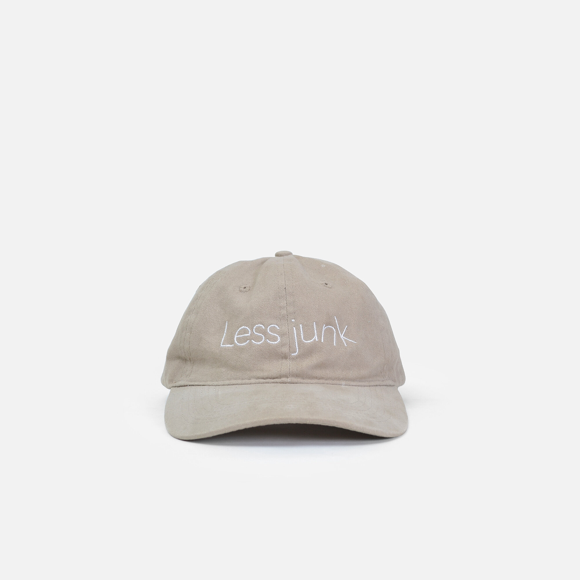
I inadvertently created the tagline, "Less junk, more Stuff."
This phrase has become my life's mantra. It identifies a problem and proposes a solution. What junk is in my life? How can I design something that functions better and is also: simple, timeless, useful, familiar, and fantastic.
My favorite part is when the tagline is shortened to "Less junk." This shortened phrase now becomes a universal campaign to design better, and is not dependent on my products as the only solution. It is a call to action and a target to focus my design efforts. My best designs will be ones that remove junk, waste, and debt (financial and metaphorical) from people's lives.
I believe good design solves problems, and bad design creates them.
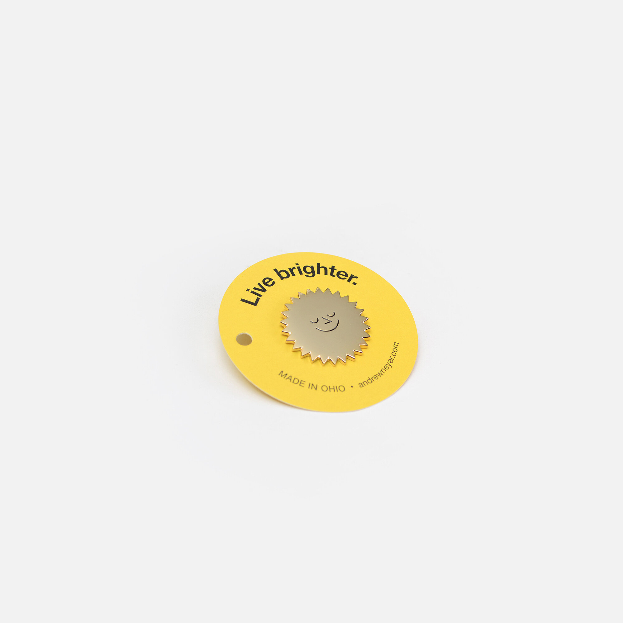
This is why I design simple and timeless Stuff, so you can Live brighter.
"Design must be an innovative, highly creative, cross-disciplinary tool responsive to the needs of men. It must be more research-oriented, and we must stop defiling the earth itself with poorly-designed objects and structures."
– Victor Papanek, Design For the Real World
METHODS OF PRODUCTION
When designing a product, I consider the following options:
User Produced
Licensed
Produced
Understanding which method is most appropriate is essential to avoid producing more junk.
Click, click, click…
You are approaching the top of the chain-lift-hill on the rollercoaster, Manifesto™. It’s about a 25 minute ride (assuming you don’t get derailed).
User Produced
A User Produced product is made, created, sourced, built, or assembled by the end-user. The user is the top priority.
The most significant difference between D.I.Y. and User Produced is that a User Produced product is designed by a professional for the non-professional. Think of it as an architect drawing construction plans. The product's value is designed-instruction. The product can be a sequence of construction steps (think of LEGO® instructions) or merely informing the user of new use, material, or resource (think of hyperlinks in a website, newspapers, or city guides).
With a User Produced product, if no one takes an interest in the product, it is not made. If 143 people take an interest, then 143 are made. The product is only brought to life in quantities of its interest, preventing the over-production of flops.
This type of "made to order" production technique is seen with digital goods such as .mp3s, ebooks, and online classes. These products are merely sets of digital codes, or designed-instructions, being translated by a device you already own to output as sound and pixels. Even with the high consumption of these products, they create very little waste. In contrast, a manufactured product requires tooling, bulk material, machines, buildings, transportation, and other factors prone to creating wastes. A manufactured product must consider all of these wastes into its price since the cost of the product = work + waste + profit.
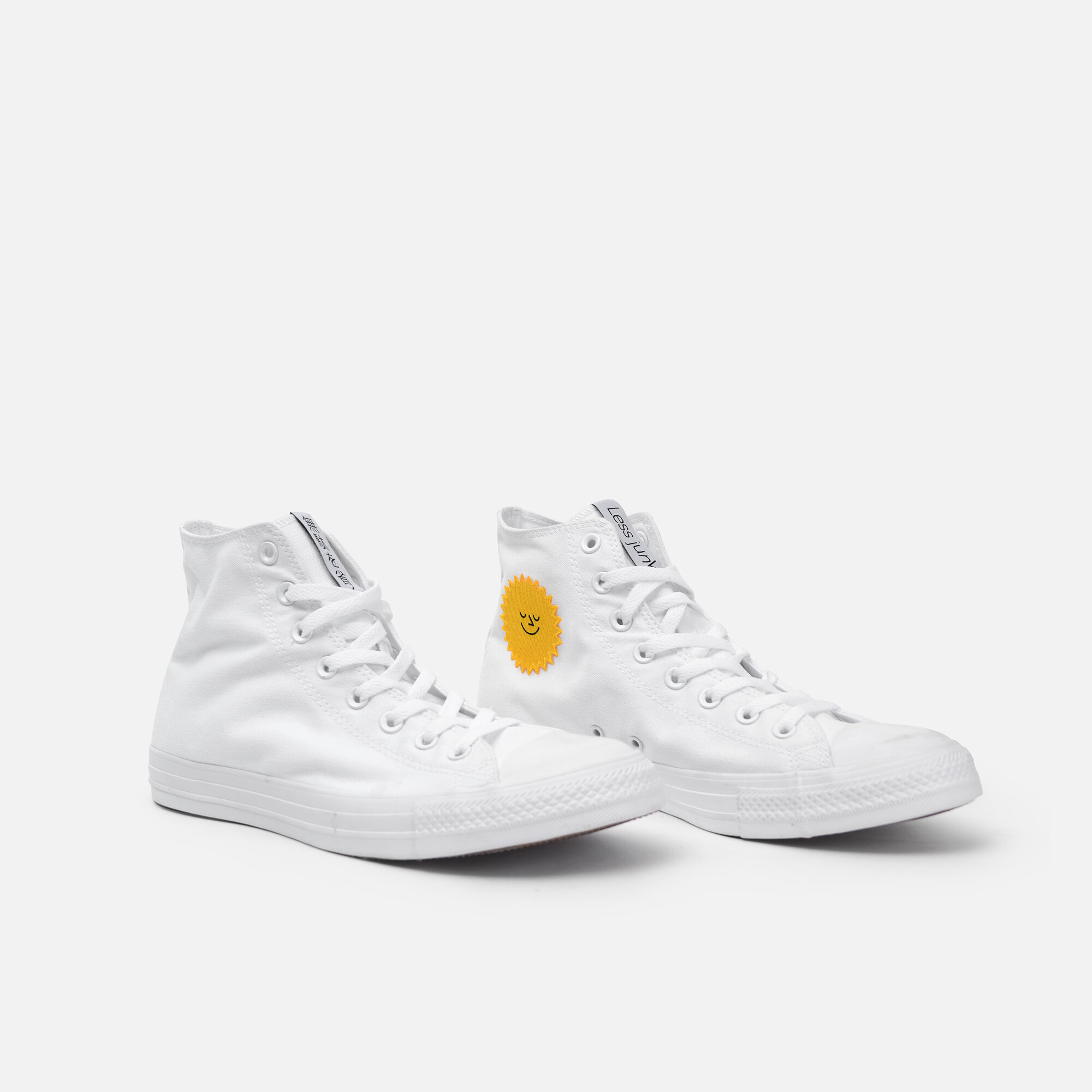
There are opportunities for physical goods to leverage the advantages we've seen in distributing digital goods. For instance, rather than making a custom sneaker for our Staff, I bought each employee a pair of Chuck Taylors, removed the Converse star from each shoe, applied a custom iron-on patch I Produced, and sewed in a custom tag to each tongue. I didn't need to develop an entire shoe when I can edit an existing one to my taste by simply removing details I do not favor and adding those I do. In this example, the shoe is the tablet you may already own, and the custom patch & tags are the .mp3s and ebooks. Because I've received numerous requests to buy our Staff Sneakers, I made a sneaker-hack set available online. The set includes: (2) "Live brighter" sun patches & (2) "Less junk / 無駄を省く" tags to be applied to shoes the user owns or buys independently to customize.
A User Produced product takes into account any objects and materials the end-user can source themselves. Instead of leveraging connections to materials and processes, this production method encourages the free distribution of resources and Producing only the items the user cannot source themselves.
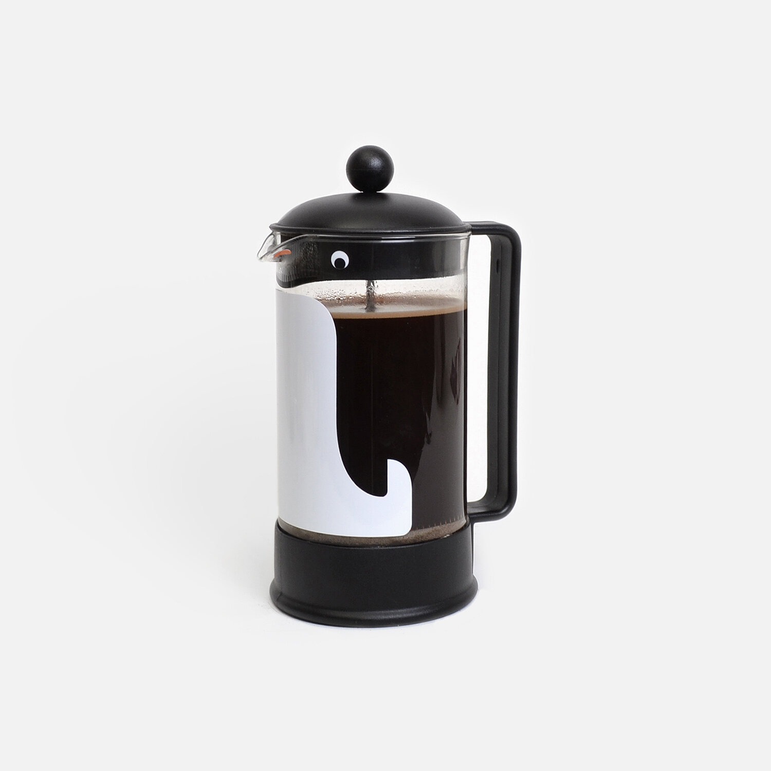
In 2013, I designed the Penguin Press; a set of decals to be applied to a BODUM® French press to make it look like a penguin. The original idea was to license the design to be printed onto the glass beaker and sold as a limited version of the BODUM classic. The more I thought about it, the person this appeals to most already owns a French press (and I don't have any good leads at BODUM). Rather than creating a new product that makes another obsolete, I redirected the design to be a set of durable vinyl decals that can be applied in under a minute. The final product is a kiss-cut decal sheet packaged inside a folded card printed with the instructions. The Penguin Press removes unnecessary manufacturing and delivers affordable customization.
“If comedy kills pretentiousness, the Penguin Press decal is kryptonite.”
– Dwell
Another motivation for designing User Produced products is that they are often inexpensive to distribute and sometimes even free. Getting as many resources and value to the user is the goal, without needing to monetize every valuable component.
We've all used great user-prioritized products (think about early Google or pre-ad Instagram) that are later compromised because there is pressure to capture revenue from the value and audience the product created. One of the best examples of a User Produced product scaling without compromise is Wikipedia. The success of Wikipedia is no accident, and they make their values known. Here are the first two paragraphs from their about page:
"Wikipedia is an online free-content encyclopedia project helping to create a world in which everyone can freely share in the sum of all knowledge. It is supported by the Wikimedia Foundation and based on a model of openly editable content. The name "Wikipedia" is a blending of the words wiki (a technology for creating collaborative websites, from the Hawaiian word wiki, meaning "quick") and encyclopedia. Wikipedia's articles provide links designed to guide the user to related pages with additional information.
Wikipedia is written collaboratively by largely anonymous volunteers who write without pay. Anyone with internet access can write and make changes to Wikipedia articles, except in limited cases where editing is restricted to prevent disruption or vandalism."
Licensed
A Licensed product is manufactured by a company (licensee) based on a licensing agreement made with the designer (licensor). Profit is the top priority, but remember that profit as a priority is the licensee's interest. The designer's, or licensor's priority, is designing a product that can be profitable.
This production method uses an existing company's experience to leverage their efficient manufacturing and distribution. It is often the better route to providing the user with a lower cost product. If a design requires too much production costs, tooling, expertise, or material sourcing for a designer to Produce, a good option may be to license the product. Access to specialized production methods can be a significant advantage in bringing a design to life, but it also comes with its challenges.
Trendy products are at the greatest risk of going out of fashion and, therefore, are prone to creating waste and are often not very profitable. This is because the product has not been proven to survive in the market, and results in inventory being made based on data projections. The ideal product to license is one that is timeless.
"You can reach timelessness if you look for the essence of things and not the appearance. The appearance is transitory — the appearance is fashion, the appearance is trendiness — but the essence is timeless.”
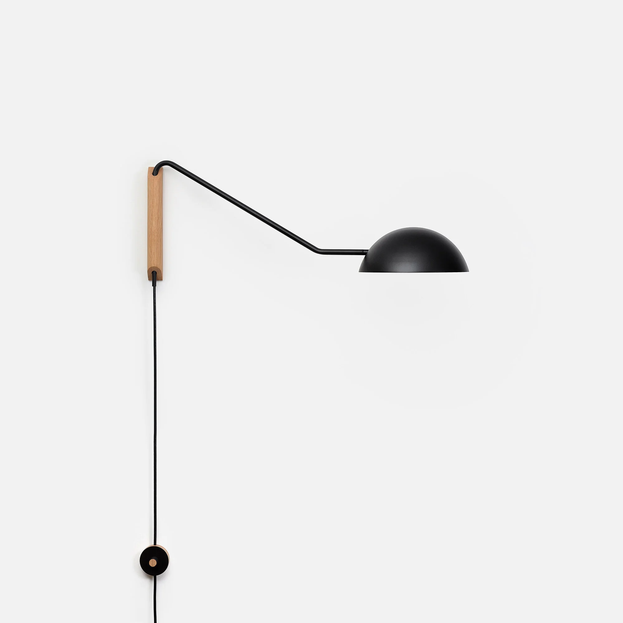
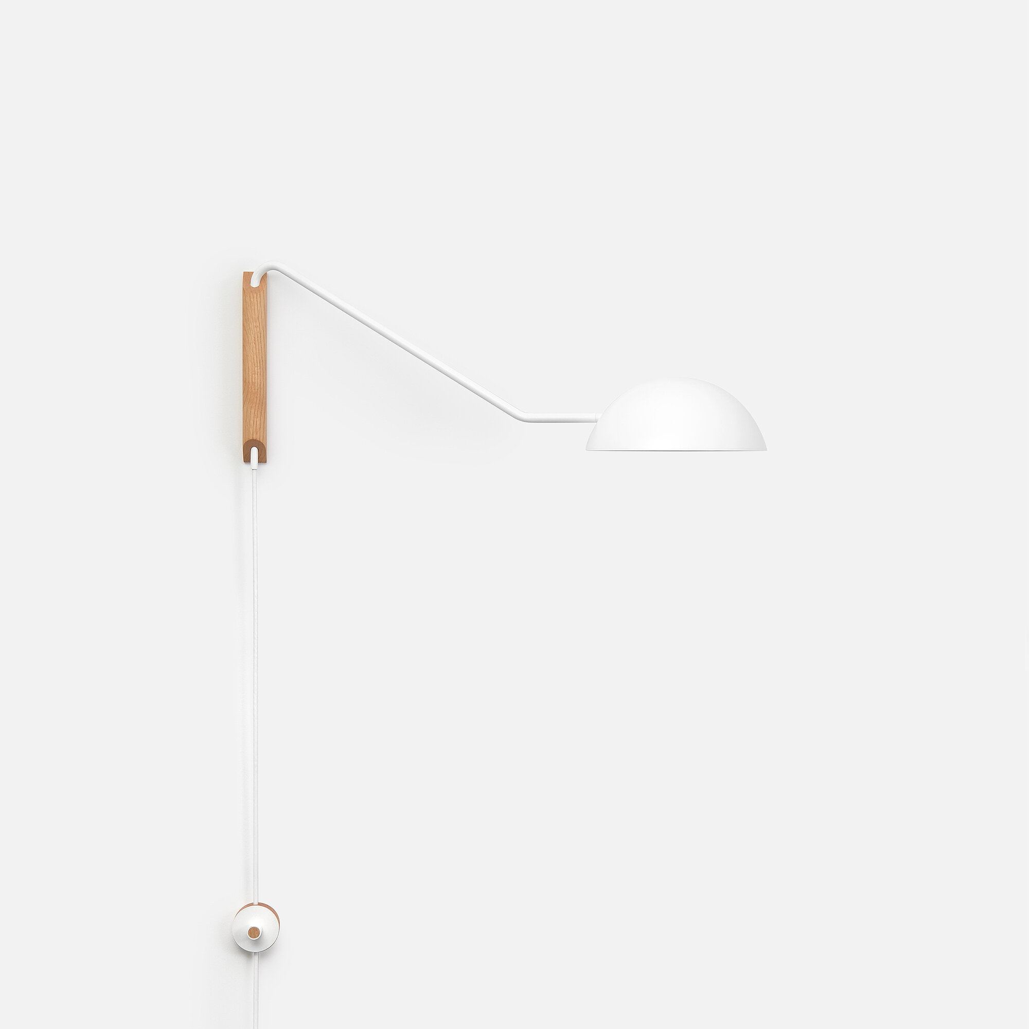
In 2012, I designed a swing-arm light with a rotating dome shade, Swing Dome Light. I wanted to expand on the Crane Light I previously designed that features an exposed bulb. At the time, I was not confident in my ability to manufacture all of the parts needed nor the funds to invest in tooling. Fast forward to 2014, and I was approached by a buyer from CB2 (who had bought a Crane Light for herself) to share other designs I was working on. The new swing-arm light was a standout. It was met with great interest and had no request for change. It seemed like a perfect match. We discussed licensing terms, I sent over final production drawings, and it felt like it was on a fast-track for release. Then, it went silent for eight months. Eventually, CB2 released the product in September 2015 as the Mantis Wall Sconce.
My decision to license the light fixture came down to, "This is a good opportunity to bring a design of mine to life, and I don't have to Produce it." Since its launch, it has remained a best-seller and has sold over 25,000 units. There were material and finish choices changed without my consent, but those types of changes were expected based on the license agreement's terms. CB2 tweaked the design to ease production overseas and to match the finishes they felt fit their customer's tastes.
(The licensed version is no longer available through CB2 as of March, 2024.)
In 2017, I decided to Produce the design to my original specifications with the improved manufacturing capabilities I gained over the years. The Swing Dome Light was launched with two arm length options (30" and 48"), better attention to detail, signature finishes, and made in Ohio.
A Licensed product is a profit-driven model. Profit is the reward from adding actual, or perceived, value to a product. The secret to highly profitable products; they add a lot of value. (Your taste and design principles are the best tools you have to create value.) Because profit is the priority, the product will inevitably be discontinued if its interest and profit decline. Good design can live here, but it will always have to wrestle with its appetite for profit.
Produced
A Produced product is a product manufactured by or overseen by the designer. The design is the top priority.
Because of this, it can be tough to make Produced goods affordable and accessible. This is the most challenging and exciting category of design for me because I want to create affordable, good designs.
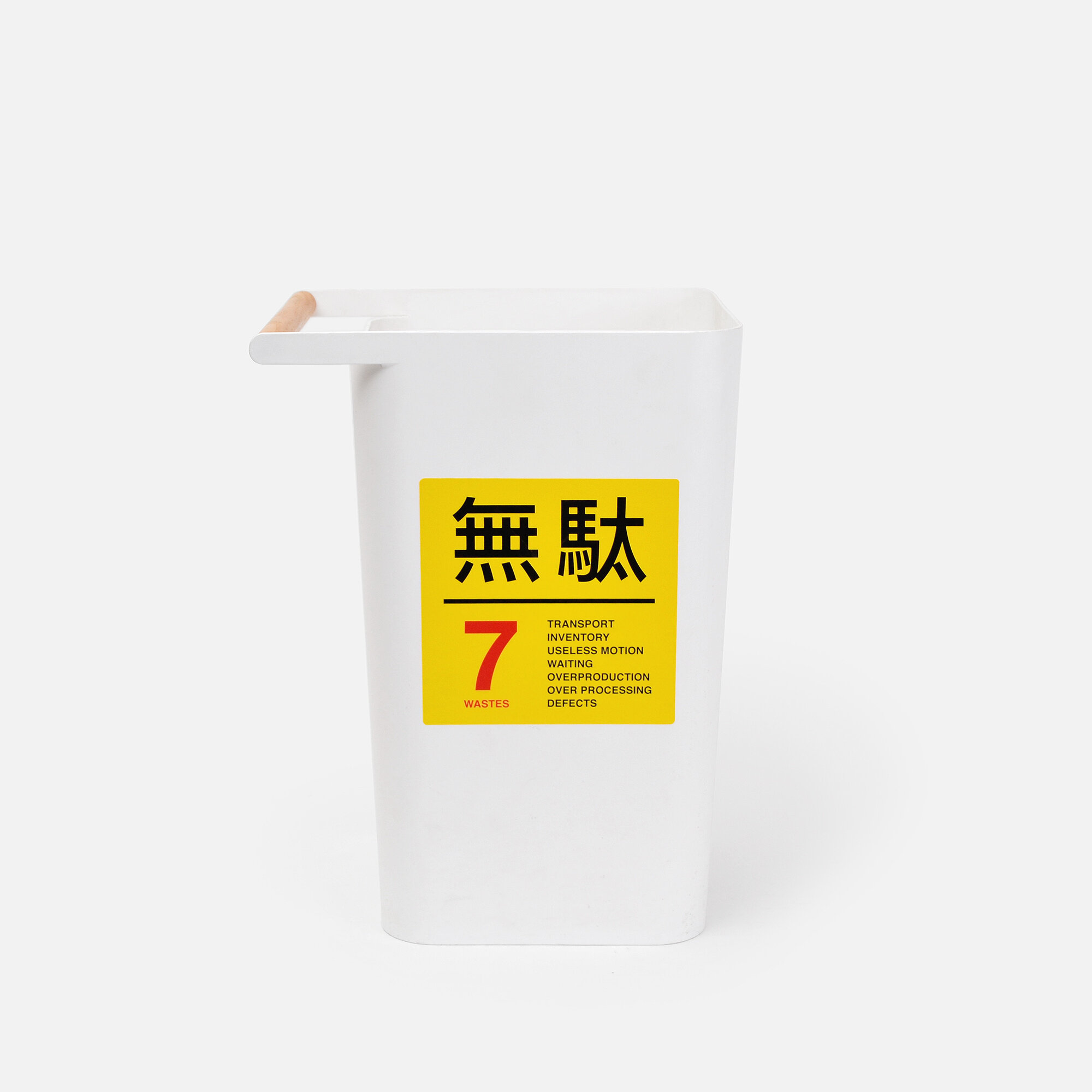
Making a product affordable requires continuous improvement (改善 or kaizen) and utilizing existing manufacturing techniques to work in tandem with the design. The goal is to remove friction. Search for wastes (tasks that do not add value) and remove them. Every detail has a cost, and if it is not part of the function or concept, the designer should exclude it, so the end-user doesn't have to pay for something they do not need or want. The details omitted can often be more impactful than the product itself. Designing this way prioritizes good design over a profit opportunity.
In 2010, I designed the Crane Light, a wall-mounted swing-arm fixture, for my home. After many requests from others to purchase, I started reproducing the Crane Light. Each year the reproductions improved as I discovered better manufacturing techniques and local fabrication partners while continually evaluating the product.
After years of Producing, I began asking myself whether or not a reproduction undermines the original work or becomes something better?
I recently had a profound experience seeing Van Gough's, Into the Undergrowth, at the Cincinnati Art Museum. The painting's colors and brushstrokes were overwhelming, and I felt like I was being pulled into the picture. It is a remarkable painting. When leaving the museum, I was pokin' 'round the gift shop and came across tchotchkes printed with the Into the Undergrowth image. There were notebooks, umbrellas, calendars, pens, posters, and even chocolate bars adorned with Van Gough's painting. The reproduction in this example undermines the original and turns a work of Art into a profit-driven gift shop charade.
The decision to bring a design into production is a responsibility all designers must face. Instead of asking, "Would someone buy this?" or "Could this be profitable?" I ask myself, "Does this product make someone's life brighter?" (the lights I design, when turned on, always hit the mark ッ). It is the most personal question I can ask myself because I have to feel the object's positive impact on my life first.
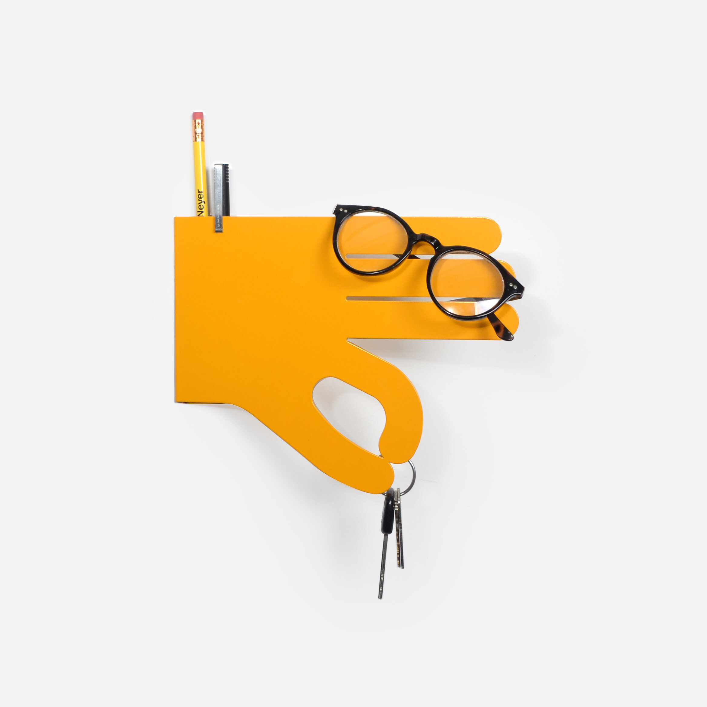
Every day in the Studio, we use a Helping Hand (2015), a key holder shaped liked a butler's hand. It is easy to quickly snatch the keys from the magnetic fingertips because of the hand's gesture. Not only is it extremely useful, but it also makes me smile every time I see it because of how human it feels, even though it is a powder-coated, laser-cut piece of 18 gauge steel. If people buy my products, I am required to think of a human using the product. That is why I try to inject wit into all my products.
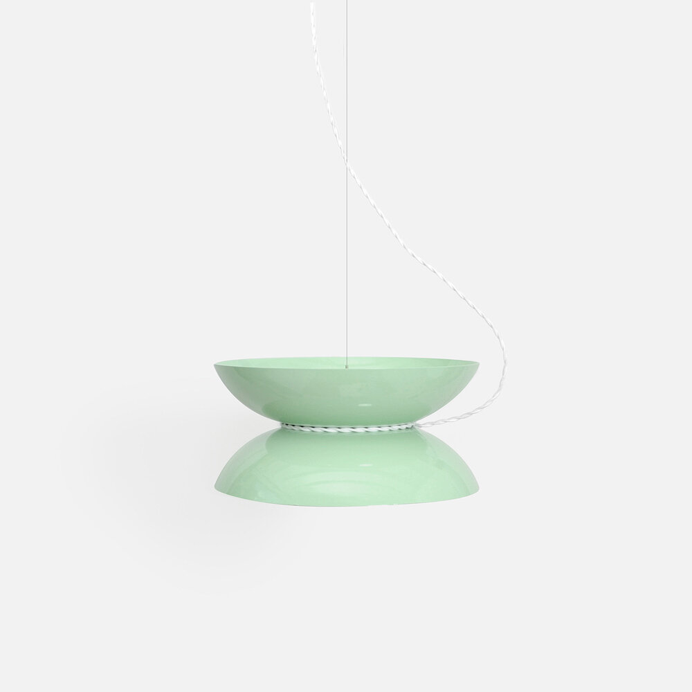
One way to add wit into a minimalist design is to use conceptual materials. The Yoyo Light (2015), a light fixture shaped like a yo-yo, is a perfect example of how material choices can improve the design. Drawing inspiration from Danish lights, I wanted to make a downlight with soft curves to offset the Crane Light and Mobile Collection's angular lines and rigidness. I was also thinking of how I could use a swagged power cord in a more gestural way. I began drawing loopy curves and tried to think of an existing object that used string or a fluid line. Almost instantly, I thought of a yo-yo. The two separate prompts collided, and with the butterfly shape of a yo-yo on its side, it was now an up and downlight with a swagged cord. Because a toy yo-yo is typically brightly colored, I felt free to pick my favorite colors without needing to justify them each conceptually. I normally use a round-jacket wire for my light fixtures, but chose to use a more decorative braided wire. Because the light's scale is enlarged, a braided power cord mimics a yo-yo's string perfectly. To top it off, we package the Yoyo Light with the braided-cord wound up around its waist, just like its namesake.
Do not choose colorways and materials for a product based on trend, but instead search for a palette that elevates the concept. Being aware of trends is helpful, but recognizing where concept-driven choices and trends overlap is the more valuable skill to hone.
“Great creativity involves having good taste, but it also about saying something that needs to be said right now. It is finding a balance between timeliness and timelessness.”
– Dr. Pizza, Creative Pep Talk #229
Another tool for inflecting wit into a design is to have it hiding in plain sight. If you want to make a remarkable and memorable design, it needs the right name.
No one forgets a title like LEGO, iPhone, or Dr. Pizza. It is not just a calling card; it's a ripe opportunity to create a new context. When we buy a product, we typically encounter its image, price, description, and, most importantly, its title. A good title becomes inseparable from the design, and a bad title is forgotten. The title Yoyo Light is maybe a bit obvious, but it is not confusing. The title sets up expectations for the form and context for its application. The title is your best opportunity to say, "This is why I made these decisions." It quickly reveals whether the choices were intentional or accidental.
One of the most influential pieces of modern art was Marcel Duchamp's, Fountain. There is a lot to unpack in this piece, but the part I'm most interested in tinklin' 'round is the concept of objet trouvé. Objet trouvé is the art of changing the context of material or, in Duchamp's case, making art from a non-art object (or ready-mades as he called them). It is a tremendous tool because it leverages the concept instead of the material (or skillful use of that material). The connotation of a urinal was changed by rotating it 90º, considering the object as Art, and choosing the title, Fountain. Duchamp's “ready-mades” created an open-ended formula to make art from non-art.
"Much of modern art is devoted to lowering the threshold of what is terrible."
– Susan Sontag, On Photography
This might sound like a crass take on modern art, but it empowers what is not considered art. That is why I look for inspiration for light fixtures in objects that do not have light bulbs. It draws on the familiar and becomes something fantastic. I have an endless well to draw ideas from when I created the title prompt of ______ Light. This type of prompt is a cheat-code for making conceptual art and design. Now, I can pick a seemingly random word such as "lime" and begin making design choices from the title, Lime Light. With this tool, I can now toggle working backward from a title or forward towards a title. The title is the design. I do not need a pencil, computer, or drill press to create a title. This realization frees my mind to create new design opportunities based on the title. At the same time, I get to prioritize my hands and eyes to scout new materials, techniques, and objects to recontextualize.
Let’s bring it home.
Understanding the different production methods and their priorities are essential to making "Less j𝘶n𝘬, more Stuff."
To illustrate again how the methods of production differ, consider the following scenario:
I designed and fabricated a 120 x 44 x 30" powder-coated steel table for my house because I couldn't find a kid-proof one I loved. Several people love the table and ask if they can buy one. Should I...?
Option 1: User Produced
Sell the table plans for $1–99 and provide local fabrication contact information. The User Produces the table by contacting the fabricator and pays them the quoted $1,215 to fabricate and powder-coat.
Option 2: Licensed
License the table design to a company located in North Carolina, and they sell it for $1,750.
Option 3: Produced
Produce the table and sell it online for $2,500.
I believe in designing for yourself first. If I do not love my work, why would anybody else? If I love my work, but no one else does, I should not bother reproducing it with the expectation someone will buy it. This sounds ridiculously obvious, but we encounter this daily; terribly designed products no one loves (40% off!). I'm not suggesting that if I don't love a particular product that makes it rubbish, but if the designer doesn't love it, why did they let it go to production? Massimo Vignelli said it best,
"The life of a designer is a life of fight: fight against the ugliness. Just like a doctor fights against disease. For us, the visual disease is what we have around, and what we try to do is cure it somehow with design."
We don’t need more stuff to love; we need less junk getting in the way.
Design Your Life.
Every day, you design your life by choosing what you love and how you love. Be more patient. Take the stairs. Look for ways to elevate objects and others to better-suited environments. Learn about problems and solve them. This is how to design everything and Live brighter.
Context
A Note To Self
Self Calibration Standard 10.15.1
Kaizen #347, DS | Dimmer Switch
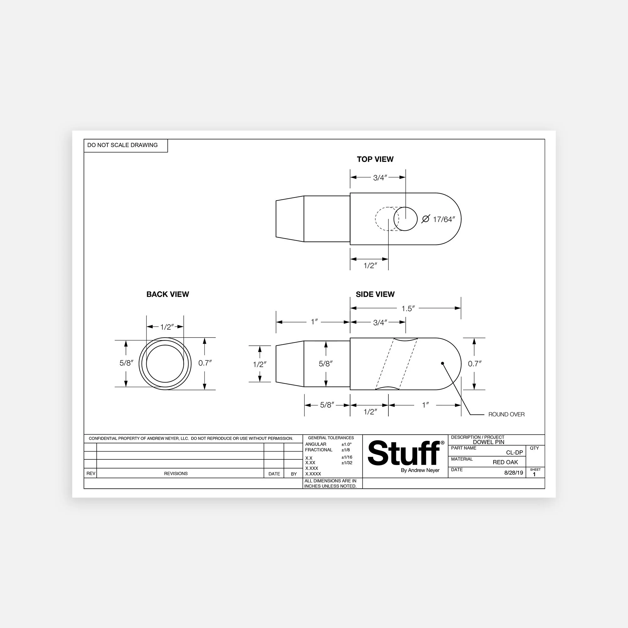
Kaizen #273, CL-DP | Crane Light dowel pin
You survived!
Thank you for reading and riding my rollercoaster, Manifesto™. I’m always curious to know your thoughts. If you would like give some feedback, give me a call (513-519-9542) or send me an email → andrew@andrewneyer.com.
Now, go rid the World of j𝘶n𝘬.
This Manifesto™ was made possible by:
• Jennifer Neyer, for editing and helping steer my Life and words.
• Andy J. Pizza, for always geekin’ out on the details of everything with me.
• Staff, for always listening to my rants and helping me build my dreams.
The following products are explorations in User Produced products and Produced goods that promote Less junk (or omitting waste, 無駄を省く), and to Live brighter. These products are intentionally void of the Stuff By Andrew Neyer mark, as they are intended to be universal and more personal to the user by waiving attribution.


